As I’m currently unable to run my lettering courses I have begun a series of tutorials in collaboration with Cyclaire Knives and Tools.
You can see my tutorial here on the Cyclaire website where you can also purchase knives and Beavercraft gouges directly from them.
Alternatively scroll down…
Here I’m outlining the way I carve my lettering from design to finished product, it’s the method that I personally use but as with anything, there are always slight variations for how you can approach carving. Feel free to experiment, as long as you get the end result you’re after without damaging either yourself or the tools I can’t see the harm!
DESIGN & LAYOUT
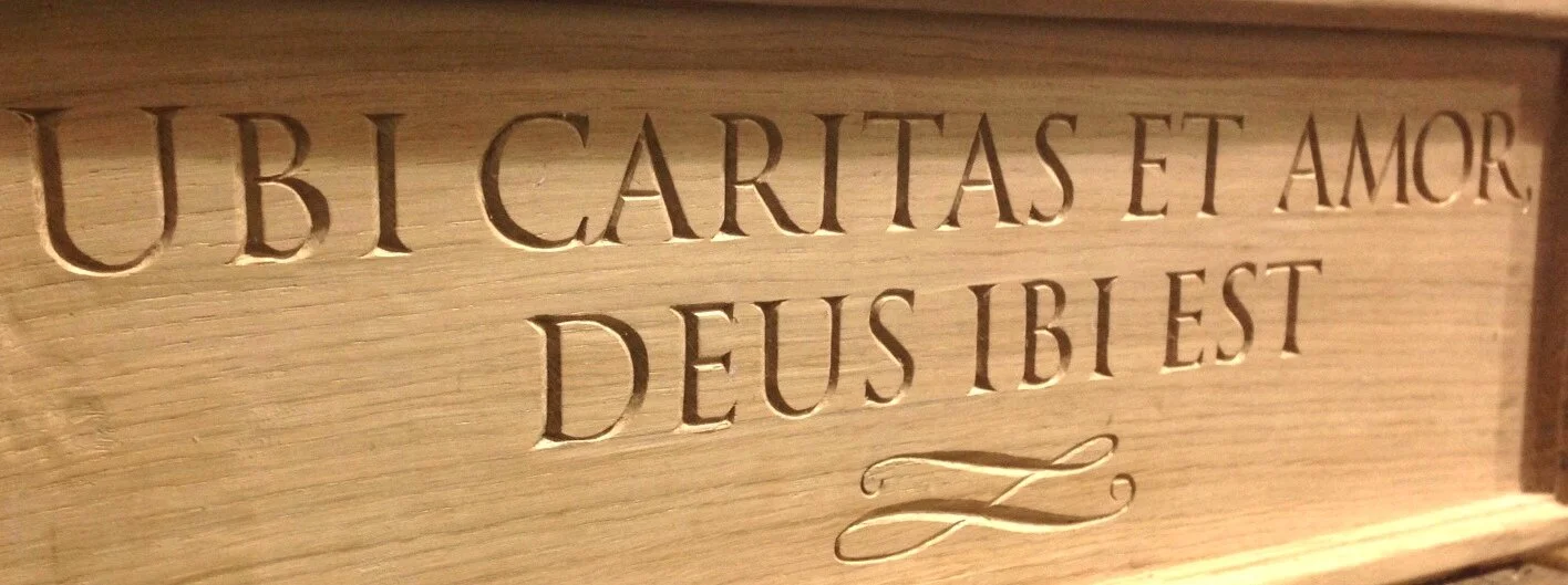
When I start out working on a piece of lettering design, the first thing I need to consider is the location and use of the piece. Is it for outside or inside? What purpose does it need to serve e.g there’s little point in having a house sign that’s in a beautiful scroll font but isn’t clear enough to read from the roadside. What’s the budget? The more complicated the font, the longer it’s going to take to carve. Is the lettering going to be painted? Gilded? All these things will influence the choice of font for the finished product. Typically for house signs I stick to either Times New Roman or Georgia, they’re nice and clear with serifs to give it a more traditional look, if it’s not a house sign or plaque then there’s more room to get creative.
In theory the world’s your oyster when it comes to fonts, have a look through what’s available on your computer or visit websites like 1001freefonts.com where there’s a vast array of designs. Have a think about what effect you want to create; clear and bold, feminine, childlike, elegant? Once you’ve found a font you like, it’s time to think about the practicalities of whether it’s suitable for carving. Where are the central stab cut lines going to go (more on these later) Are some of the lines too thin to show up clearly when carved or to get paint into/gild, if so, would it ruin the look if you widen the lines slightly. If working on a commission- how much time does the budget allow for carving? Try carving just one letter to get an idea of how long it will take, this is particularly relevant when looking at italic/ornate fonts. Capitals are quicker to carve than lower case so that will have an influence as well.

A san serif font for a bench in a children's playground

Not the easiest of fonts to read but one that was specified by my client. It's for a dog water bowl station so the font could afford to be more decorative.

A more fanciful font for the entrance to an adventure playground.
Georgia Font, clear and easy to read for a wall plaque.

Trying out a few fonts next to each other for comparison.
Don’t forget to consider the overall shape of the lettering. Do you want it just in a straight line? Consider curved or with a more creative approach to the layout, particularly if it’s a saying or excerpt from a poem. I often make thumbnail sketches to try out various layouts, this is a real opportunity to get the creative juices going. Research images online, keep your eyes peeled and take note of signs you like the look of when you’re out and about.
Decoration
Another thing to consider when looking at the overall layout is whether you wish to include any additional decorative elements. Borders, corner motifs, scrolls…just be careful not to overload your piece with too much. The eye should still be drawn to the lettering first, with the decorative elements enhancing but not detracting from this.

Corner Acorn motif

Simple scroll design to add interest
Transfer of design and Kerning
There are a couple of options for getting the design onto your chosen piece of wood. You could draw it on freehand, print the lettering off and trace the outline with some carbon paper underneath or my preferred method, stick the paper to the wood and carve straight through it. With regards to the grain on the wood, I usually have the grain going horizontally rather than vertically.
Some people don’t like the idea of carving straight through the paper but I find this is the most efficient way of transferring the design onto my work. I simply print off the lettering and apply SprayMount onto the back, wait a few minutes until tacky, then stick it to the wood. Don’t be tempted to stick it on too soon, if you do this it can be a pain to remove and you’ll have glue residue on the wood. Quite often the paper only stays on the wood long enough for me to lightly mark out the outside edges of the letter to use as a guideline. You’ll find that after a while the paper starts to shred where you’ve sliced through it and it just becomes a nuisance.
Kerning is the official word for the spacing in between letters and whilst I often stay true to how the computer has set up the spacing (this saves a lot of time), there are occasions when it is necessary to alter kerning manually. The spacing is a bit of a tricky one to write guidelines for as quite often it’s just a case of it not looking quite right. Even though technically it should be, it just doesn’t look it. This is when I will do a bit of chopping and changing to the print out. Using Microsoft Word, I can alter the spacing by going to ‘Font’, ‘Advanced’ and expanding or condensing….

Some simple rules that I find helpful:
1. Focus particularly on slanted uppercase letters, eg. W, V, A, Y, K, these can be more problematic than straights.
2. Two straights together require more space than a straight and a round, and two rounds need the least amount of space. E.g HI requires more space between the letters than le and even less for eo
3.Take a step back…once I’ve got the template in place I always take a few steps back and view from a distance.
4.When cutting out the template, cut as close to the letter as possible so your eye isn’t tricked by the white of the paper between words.
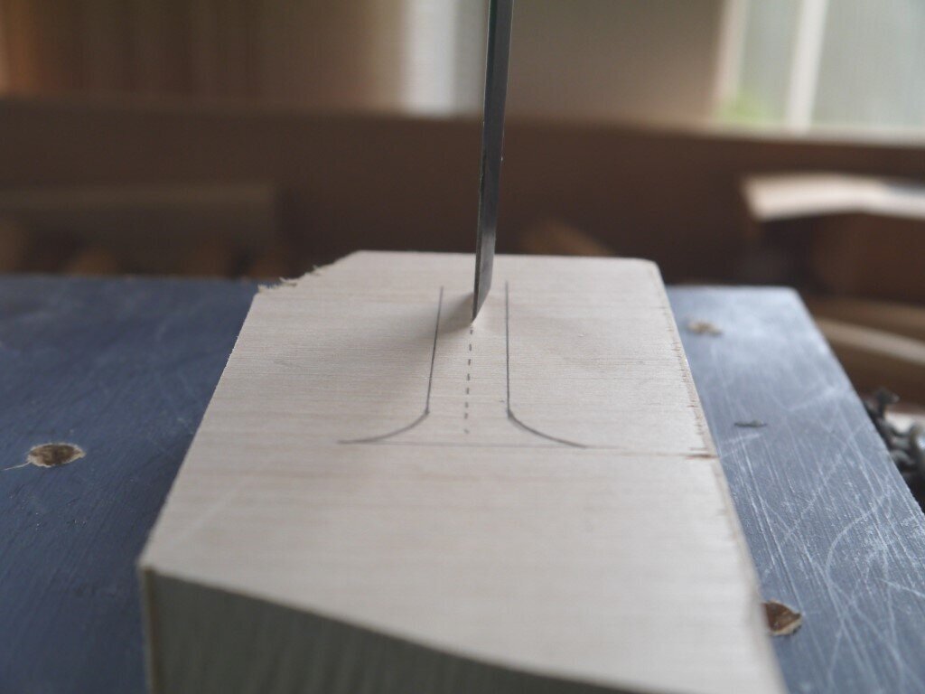
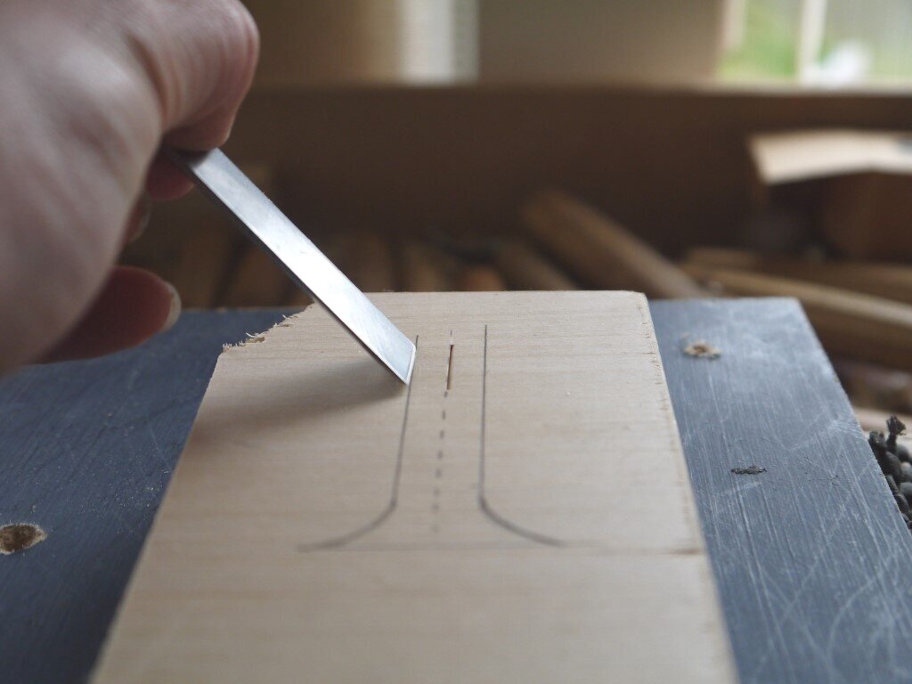
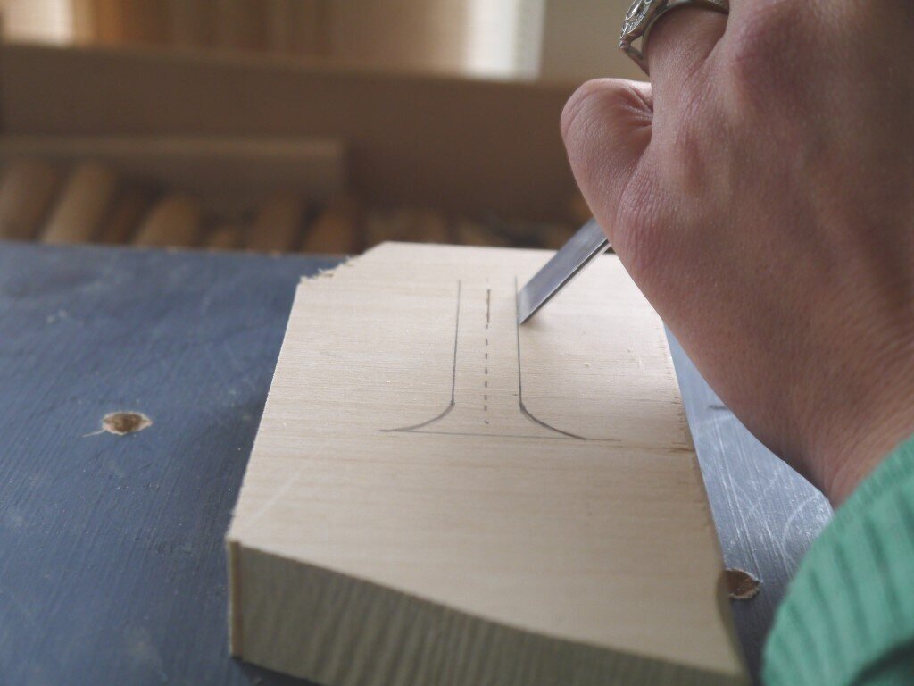
Carving straights
Hopefully by now you’ve sorted out the layout, decoration and font for your piece of lettering. Using whichever method you prefer, your lettering outline should now be on your chosen piece of wood. Now it’s time to get started on some carving!
The basic idea for this sort of lettering is that we’re carving a ‘V’ into the wood, therefore it will consist of at least three cuts. The first being the central stab cut coming straight down at right angles to the surface of the wood(1), then come in from one side and carve down to the same depth (2) and repeat for the other side (3). Repeat these cuts all the way along the length of the straight.