Serifs
When carving serifs I like to use either a reasonably wide (around 15mm) No.3 Pfeil fishtail or, in this case, I’ll be using the Beavercraft G3/20. I find that it produces a nice curve to the shoulder.
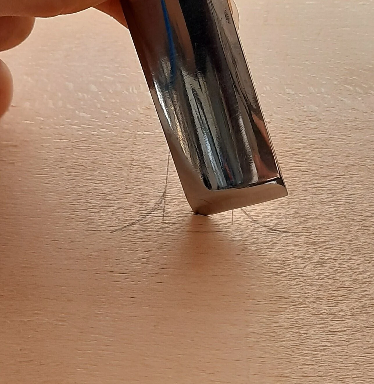
When looking at the serif I start by mentally deciding where the deepest part of the serif is going to lie, if you think it will help then mark a dot on this point. This is going to be deeper even than the bottom of the V on the straight. (1)
I like to always carve the rest of the letter before the serif but this is just personal preference. (2)

1.

2.
Start with a corner of the gouge on the dot representing the deepest point of the letter. Keep the gouge at about 45° angle (3) as you cut down so it naturally creates a deeper point sloping up to a very shallow at the point of the serif. Repeat this for the other side, again starting with the corner of the gouge on the dot and letting the curve of the gouge create the curve of the stab cut. (4)
3.

4
Next, start from the outside point of the serif and carve towards the dot following the curve of the stab cut you’ve just made. (5) and repeat coming from the other side (6)

5.

6.
Try not to alter the angle too much as you’re carving down towards the bottom of the valley, also keep an eye on the other corner of the gouge to make sure it doesn’t dig into the side of the letter (8).

7.

8.

9.
To blend the shoulder of the curve nicely into the straight, I often use a chisel just to take off any ridge that may have appeared (9)
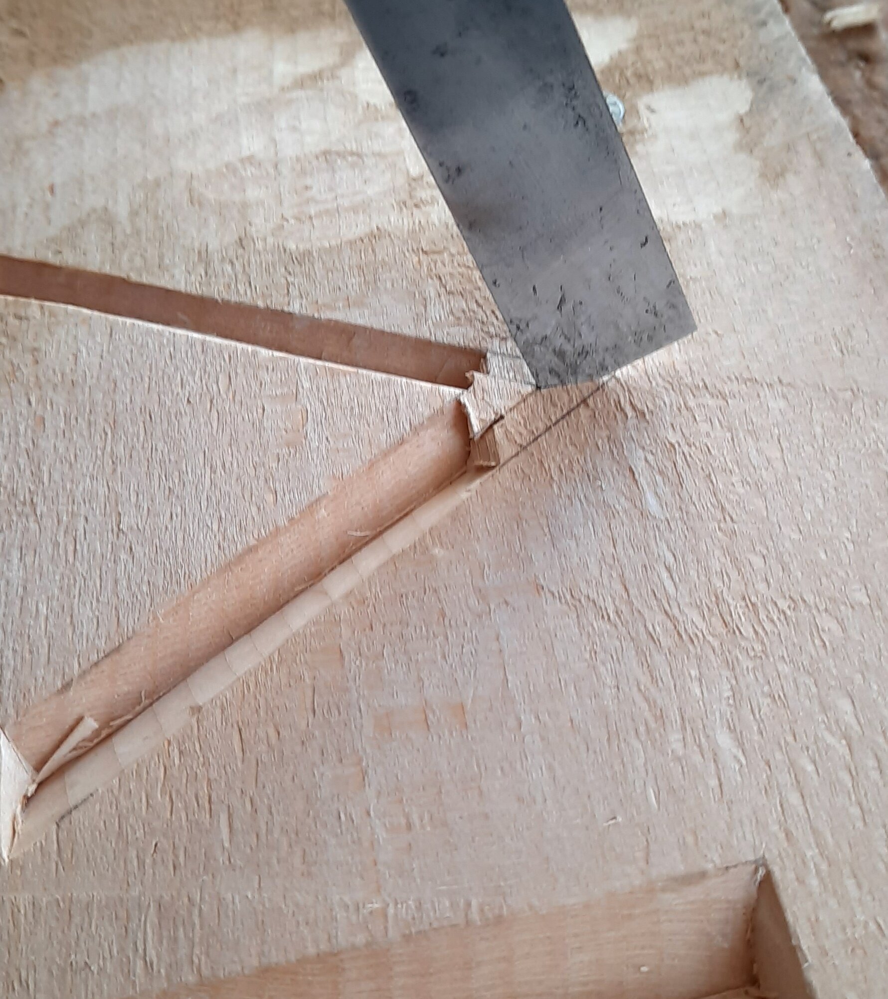
The bottom triangle now needs to be removed. The distance between the deepest point and the base line determines the angle that you need to hold the chisel at. Again, start with one corner of the chisel as the shallowest point of the serif and carve towards the deepest point whilst maintaining the same angle to ensure a clean cut (10). This can be tricky as you need to keep an eye on both the point of the chisel heading towards the centre as well as ensuring the other side of the chisel is carving a straight base line and doesn’t scallop out where you need it to be flat.(11 &12)

10.

11.

12.
Apex
Generally with traditional style fonts you will have one straight narrower which I demonstrate here. The process is the same even if the straights are the same width.
1.
Begin with carving the straight as normal but leave the area around the apex untouched for now.
When you’re ready to tackle the apex begin by making an angled stab cut with the corner of your chisel going in at the deepest section and maintain a roughly 45° angle so that it’s very shallow at the top. (1)
Then go back to the left hand straight and bring your chisel so that meets the centre line on the other straight. (2) Carve straight down and repeat on the other side, this then naturally created the inside line of the apex (3).

2.

3.
There are several ways to carve the outside angle of the apex but this is the way I find works best for me. I carve along the straight until the corner of my chisel meets the deepest part of the apex (4), I then pivot the chisel on this point rocking it to the top corner (5). I then repeat this on the other side. Take a look at the accompanying video to demonstrate how I do this.

4.
The finished apex.


5.
